Page 1 of 2
3 studio eight logo choices
Posted: December 11th, 2006, 6:01 pm
by Doreen Peri
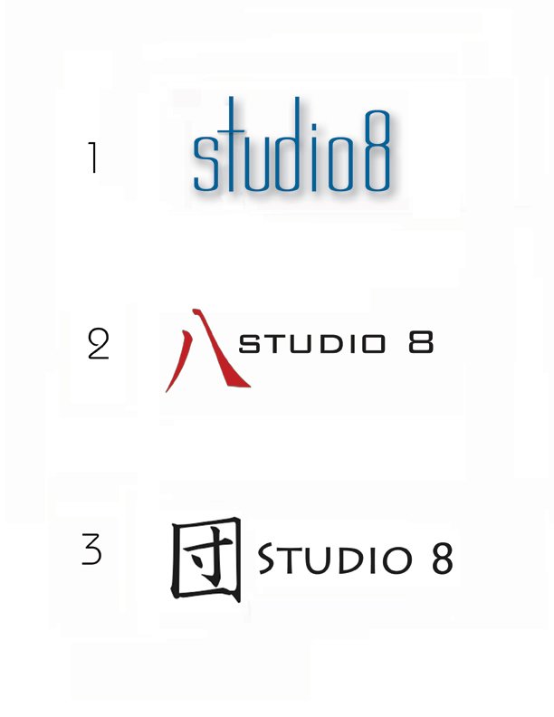
#2 is the japanese kanji symbol for 8
#3 is the japanses kanji symbol for group (like in collaboration maybe?)
just playing with colors... i donno yet... need a logo soon
for the store, for the book, etc
please vote.. thanks
Posted: December 11th, 2006, 9:15 pm
by stilltrucking
All I see is a red x
Posted: December 11th, 2006, 10:04 pm
by Doreen Peri
refresh the page... it's there..

Thanks!
Posted: December 11th, 2006, 10:20 pm
by stilltrucking
I refreshed, I shut down the computer and restarted, still a red X. Could be my funky puter. I don't know, anybody else having a problem seeing it?
Posted: December 11th, 2006, 11:35 pm
by judih
yes, i'm red-x'ed also.
hmm.
i'll keep trying.
Posted: December 11th, 2006, 11:37 pm
by judih
no luck. Even clicking into it from the parent directory isn't offering any image.
Posted: December 11th, 2006, 11:53 pm
by Doreen Peri
OK. Sorry. Wonder why I can see it and you can't?
I'll go back to photoshop and resave it using the "save for web" function and upload it again.
Somebody else musta seen it other than me..

... 'cause 2 people voted... hmmm...
gimme a coupla minutes
thanks
Posted: December 11th, 2006, 11:58 pm
by judih
If the image is stored in your 'cache', then you'll see it.
waiting to join the happy voters....[/b]
Posted: December 12th, 2006, 12:00 am
by Doreen Peri
can you see it now?
not my greatest logo designs but any of them could work... i sorta like #1, but i voted for #2 'cause i like it, but #3's ok.
then i look at them and hate them all
then i look at them again and like them all
i'm wishywashy

what say you?
Posted: December 12th, 2006, 12:04 am
by judih
i said '3' cause i like the combination of symbol and font.
in my mind, though, i was imagining a slim, but not too slim, elongated 8 done in a medium-fine brush and red ink, slightly leaning towards the upper right corner.
(yeah, that's what i saw)
the Studio could be placed on the left side of that.
so this is not a 'none of these' but rather my secret dream Studio 8
Posted: December 12th, 2006, 12:27 am
by stilltrucking
yes I can see them too. thanks.
I will vote in the morning.
Posted: December 12th, 2006, 2:37 am
by Doreen Peri
Maybe we should just use this one?

Posted: December 12th, 2006, 6:28 am
by panta rhei
i voted # 2.
i like the red and the black, and the simplicity of it.
btu do we have a relation to anything japanese, aprt from haiku?
Posted: December 12th, 2006, 6:50 am
by panta rhei
i played around with the eight-loop a while back...

doodling.
Posted: December 12th, 2006, 8:07 am
by Dave The Dov
Hmmmm you think just simplifying it down to the "S" and the "8" could work????
_________________
Honda NX250