Page 1 of 1
Which is better? And Why?
Posted: March 10th, 2005, 11:19 pm
by Doreen Peri
Posted: March 11th, 2005, 12:15 am
by judih
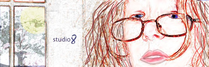
i chose #1 cause i see the face as a 'daylight' face.
love this banner.
it's open, it's private, it's willing to speak to me, it's harboring issues that need to be expressed, it's waiting for an ear.
Posted: March 12th, 2005, 12:47 pm
by mousey1
I really like this!!!!
Who did yon, I mean, above yon banner?
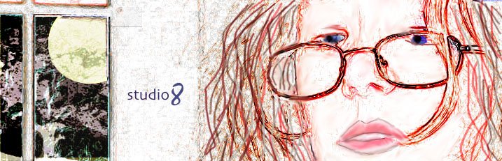
I voted number 2, for I love the moon.
Posted: March 19th, 2005, 10:54 pm
by oneeyeddog333
all three are good i chose 2 no special reason
Yep!
Posted: March 19th, 2005, 11:12 pm
by Sober Duck
I have to go with the majority.
For me #2 will do.
The darkness gives balance.
Posted: March 20th, 2005, 6:21 pm
by Doreen Peri
Thanks, all, for taking the time to look and for your votes!
It was just one of those times when I couldn't decide which worked best.
I'm leaning toward #2, myself, because I think the darkness outside the window adds balance to the piece, as the SoberOne said.
Yes, mousey1, I created this. People tell me nobody's interested in "sausage-making" but since I'm *always* interested in how someone created something, I'll explain anyway.
I started with a photo of my daughter. She's 12 but I didn't want her to look that young, so I used some Photoshop filters to alter the face to make her look older. Then I removed the entire background, except for the window, including a lot of her own hair and drew the hair myself, using the brush tool and other Photoshop tools. I also drew in the eyes. I found a photograph I took of a tree and used resized and cropped it to fit in the panes of the windows. I drew in the sun (or moon in #2), filled it with a yellow, using multiply. Once I was satisfied with the face and window, I flattened the image and applied more effects to the image as a whole, to make it look like a drawing, plus used the line tool to draw to highlight her glasses and other areas which I wanted to accentuate.
That's it. Thanks again, everybody.
Posted: March 20th, 2005, 6:21 pm
by Doreen Peri
Thanks, all, for taking the time to look and for your votes!
It was just one of those times when I couldn't decide which worked best.
I'm leaning toward #2, myself, because I think the darkness outside the window adds balance to the piece, as the SoberOne said.
Yes, mousey1, I created this. People tell me nobody's interested in "sausage-making" but since I'm *always* interested in how someone created something, I'll explain anyway.
I started with a photo of my daughter. She's 12 but I didn't want her to look that young, so I used some Photoshop filters to alter the face to make her look older. Then I removed the entire background, except for the window, including a lot of her own hair and drew the hair myself, using the brush tool and other Photoshop tools. I found a photograph I took of a tree and used resized and cropped it to fit in the panes of the windows. I drew in the sun (or moon in #2), filled it with a yellow, using multiply. Once I was satisfied with the face and window, I flattened the image and applied more effects to the image as a whole, to make it look like a drawing, plus used the line tool to draw to highlight her glasses and other areas which I wanted to accentuate.
That's it. Thanks again, everybody.
Posted: March 20th, 2005, 8:07 pm
by Artguy
#3 the left side of the work blank without prejudice....you fill in the blank...
Posted: March 21st, 2005, 7:54 am
by Traveller13
I prefer #2, don't ask why
Posted: March 24th, 2005, 4:34 pm
by e_dog
i say 1 and 2 are equally good; or rather they are companion pieces in a necessarily linked series, much like night and day in the world more generally.