
I drew it in Flash. Vector graphics are the shiz-nite.
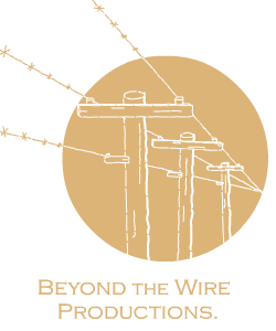
The logo is designed to depict both meanings of the phrase "beyond the wire": beyond the telephone & power wires, that is, where the power lines don't go; and beyond the barbed wire fences, beyond the boundaries. Both of these are supposed to suggest going beyond the familiar and into the wild, untamed, new, and/or strange. The way that the lines break out of the circle is also indicative of this. The off-kilter angles of the poles and the asymmetry also hint at strangeness, and the rugged linework hints at the wildness.
