Page 1 of 2
What is your first impression of this piicture?
Posted: May 4th, 2009, 7:50 pm
by stilltrucking
Posted: May 5th, 2009, 11:39 am
by Barry
Make a great postage stamp. Like the LOVE stamp.
Posted: May 5th, 2009, 12:15 pm
by stilltrucking
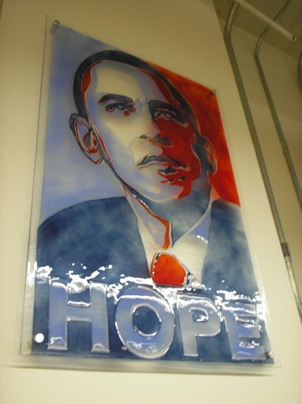
I must be a sick puppy. Looks like blood to me. Blood running down his neck from a head wound.
Posted: May 5th, 2009, 3:24 pm
by Barry
First thing I thought of first time I ever saw it was the LOVE stamp from the seventies. Or was it the sixties? But, yeah, I guess you're right. Let's hope not.
Peace,
Barry
Posted: May 5th, 2009, 3:49 pm
by stilltrucking
He is the best thing to happen to the USA in a long long time. I hope not too.
Posted: May 5th, 2009, 4:49 pm
by Doreen Peri
It's the same piece of art that was used throughout the campaign. I like it! I don't see blood at all. I just see an Andy Warhol style of colorful full contrast.
Except not sure what's around the word HOPE. Is that clouds? Or ice?
never saw that part of it before... that stuff around the word HOPE.
What's that look like to you?
Posted: May 5th, 2009, 4:51 pm
by Doreen Peri
is this site running really slow or is it my connection? It just took like 3 or 4 minutes for that last post to post...
Posted: May 5th, 2009, 5:19 pm
by stilltrucking
Seems slow to me too.
I thought it was a slow day on the internet.
I notice that white too, kind of looks like frost or ice. I wondered what the artist's intent was.. Maybe DTD knows he was at the exhibition.
Image courtesy of Dave The Dov on his Pic This art log
Posted: May 5th, 2009, 9:04 pm
by Arcadia
suddenly first impression? he´s worried ... and hope is sub-merged or in e-mergency!

mmm... well, you asked!...

Posted: May 5th, 2009, 11:20 pm
by stilltrucking
I am twisted. It looks like blood to me.
Posted: May 6th, 2009, 10:38 am
by Barry
I think the white stuff around the word HOPE is glare.
Posted: May 6th, 2009, 11:20 am
by mtmynd
I think you're right, Barry...
http://www.studioeight.tv/phpbb/viewtop ... 845#108845
This piece is evidently done in glass... hence the glare, imho.
Posted: May 6th, 2009, 12:10 pm
by stilltrucking
ok the white stuff is glare
one less mystery for me
What is the red stuff?
At first I thought it was stained glass but Dave said it was "Blown Glass"
I am hoping he can tell us more about it. He actually saw it in the three dimensional world.
Posted: May 6th, 2009, 12:45 pm
by Doreen Peri
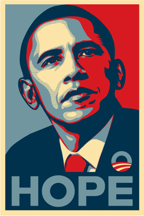
It's just a painting of this poster
http://cyanatrendland.com/wp-content/up ... fairey.jpg
The poster was used extensively in the campaign. It's done in a style like Andy Warhol popularized.... a high-contrast two-color image. Warhol created some like this of Marilyn Monroe, remember?
In addition this style was used by CNN and other networks for their campaign headlines and images of the other candidates. It was a high-contrast theme.... an art style.
Posted: May 6th, 2009, 1:06 pm
by stilltrucking
Yes thank you
I can see it better now.
You eased my paranoia