Studio eight banner.

Gallery of rotating banners.
User avatar
Doreen Peri
Site Admin
Posts: 14598
Joined: July 10th, 2004, 3:30 pm
Location: Virginia
Contact:

Post by Doreen Peri » January 31st, 2005, 9:37 pm

Thanks, judih! I feel kinda bluesy in a good way usually, plus the page has a blue and grey style, so I try to accentuate the blues on some of the banners to match. hmmm... "accentuate the blues"... I like that! sounds like a poem title! :D

Deb, if you get that trip planned, let me know and we could get together and meet. We're only 20 miles outside of DC! I've been using this thread to document the rotating banners. You'd like to see them all on one page? Sounds cool! Maybe I'll do that one day, too. (would that be overkill? LOL! i donno...)

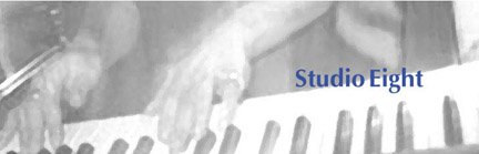
Here's today's banner, which I've had up before. It's from a photo LR took of my fingers. Somehow the photo had a ghost type effect to it which I thought was cool. :)

Image

User avatar
bennie
Posts: 185
Joined: September 13th, 2004, 6:49 am
Location: scotland
Contact:

Post by bennie » February 1st, 2005, 9:51 am

I really like the latest masthead, doreen. It's beautiful.

I love the colours (colors) and the little figures to the right of the tree. The studio Eight logo with the O inside the oh looks really nice too.

Are you a graphic designer or something? :wink:
well I write music review so I do:
http://www.elevationstation.net

User avatar
Doreen Peri
Site Admin
Posts: 14598
Joined: July 10th, 2004, 3:30 pm
Location: Virginia
Contact:

Post by Doreen Peri » February 1st, 2005, 12:57 pm

hey bennie! thanks for the kind words... i didn't know how this one would go over. It's an ad for a horror matinee at the studio eight theatre... ;) I don't know how long I'm going to keep it up... I'll add a little version to this thread in a bit ... i'm not sure how much i like it but I'm really glad you do... last night I loved it! ... but this is the morning after and you know how that goes. Last night all my poetry was excellent, too, but this morning, it ALL sucks! ;) am i a graphic designer? well, i do ads... so i'm no artist... lol *wink*

User avatar
stilltrucking
Posts: 20646
Joined: October 24th, 2004, 12:29 pm
Location: Oz or somepLace like Kansas

Commercial Company

Post by stilltrucking » February 1st, 2005, 1:30 pm

I knew it was too good to last. nobody going to pay two bits to read my sh*t.


seriously this might be the one I like the best so far, do I owe a quater? going to save it if you don't mind.
______________________________

User avatar
Doreen Peri
Site Admin
Posts: 14598
Joined: July 10th, 2004, 3:30 pm
Location: Virginia
Contact:

Post by Doreen Peri » February 1st, 2005, 7:21 pm

ok, the first Studio Eight Horror Matinee's over .... everybody check under yer seats for the gum LR spit out .... whoever finds it gets in free next show... heh ;) .... taking it down soon :)

Image

and hey, Truckin', you're the cashier, aren'tchya? you get in free every day for every show! and as for the screenwriting, well, hell, this has been such a box office blockbuster, we can pay you the only 25¢ we got now... lol ;)

seriously, though, if you all have any other films you'd like to see made into banners, lemme know ..... I sorta like the movie theater theme.

surfermike
Posts: 55
Joined: January 15th, 2005, 7:59 pm
Location: White Rock, B.C. Canada

Post by surfermike » February 1st, 2005, 8:02 pm

:P
Wo;uldn't it be cool to have a poster
for the film "Some Like It Hot" with
Maralyn Monroe. I love her. She was
murdered you know. The Kennedys.
Of course we don't want to go there
for at least another thirty-five years.

User avatar
stilltrucking
Posts: 20646
Joined: October 24th, 2004, 12:29 pm
Location: Oz or somepLace like Kansas

Post by stilltrucking » February 1st, 2005, 8:55 pm

Hearts In Atlantis,
Just finished it watching it, the bars, neon signs, the black and white misty cobble stone streets railroad tracks the fifty nine Chevy, the shadowy silhouettes in trench coats and hats, the kids bikes. nice flick too
_____________________________________
Of course we don't want to go there
for at least another thirty-five years
.

Ten four I can hardly wait until I am 99 so I can find out. I used to think those guys around Dupont Circle back in the sixties, the black power dudes were talking nonsense when they said the white man killed Malcolm, I knew it was those black Muslims

User avatar
judih
Site Admin
Posts: 13399
Joined: August 17th, 2004, 7:38 am
Location: kibbutz nir oz, israel
Contact:

Post by judih » February 1st, 2005, 11:51 pm

love this patchwork colour banner with the quarter note 'd'---
great.
this is becoming the highlight of my morning - to catch the newest banner

judih

User avatar
Anonymous-one
Posts: 375
Joined: August 16th, 2004, 11:20 pm
Location: Montreal , Quebec

Post by Anonymous-one » February 2nd, 2005, 12:12 am

Reminds me of the posters around Montreal during

the summer jazz festival , love it . A-O.

User avatar
Doreen Peri
Site Admin
Posts: 14598
Joined: July 10th, 2004, 3:30 pm
Location: Virginia
Contact:

Post by Doreen Peri » February 2nd, 2005, 12:50 pm

thanks much judih & A-one

i think it looks like wrapping paper. maybe i'm just a wrapping paper designer. LOL... is there money in wrapping paper design? hmmm... i wonder ;)

change is good, though ... i like change

A-One - you said in your email that several designs were attached but only one came through.... nice one, too! (the clock) Could you please send the others attached to separate emails? Thanks!
-------------------
Edit - Thanks A-One... got your mail! Collaborating with ya! Putting it up soon.
-------------------
here's the wrapping paper... lol ;)
Image

User avatar
Doreen Peri
Site Admin
Posts: 14598
Joined: July 10th, 2004, 3:30 pm
Location: Virginia
Contact:

Post by Doreen Peri » February 3rd, 2005, 7:25 pm

today's banner was courtesy of Pierre Bouchard...

Thank you, Pierre!

Image

User avatar
stilltrucking
Posts: 20646
Joined: October 24th, 2004, 12:29 pm
Location: Oz or somepLace like Kansas

Post by stilltrucking » February 5th, 2005, 11:34 am

Spring, i
s that a tulip?
Yellow on black I like dat
studio eight font is nice too, what is it?

User avatar
Doreen Peri
Site Admin
Posts: 14598
Joined: July 10th, 2004, 3:30 pm
Location: Virginia
Contact:

Post by Doreen Peri » February 5th, 2005, 12:40 pm

hey Truckin'! Yes! I'm ready for Spring! I thought I'd brighten it up a little over here.

It's a calallily from my garden .... a photo I took a couple of years ago.

On my screen, you can see some of the green lilly leaves and stem underneath the Studio Eight text .... on LR's screen, it's too dark to see them, so it looks all black. You never know what you're getting when you post something to the web... everybody has different screen resolutions and gamma settings (dark/light, etc.)

The font is "Optima" - it's the primary font I've been using for a lot of the banners.

Thanks for asking! Glad you like it!

User avatar
mousey1
Posts: 2383
Joined: October 17th, 2004, 3:54 pm
Location: Just another animation.

Post by mousey1 » February 5th, 2005, 12:58 pm

Is that really a callalily.........

OR ARE YOU JUST HAPPY TO SEE ME? :shock:

User avatar
Doreen Peri
Site Admin
Posts: 14598
Joined: July 10th, 2004, 3:30 pm
Location: Virginia
Contact:

Post by Doreen Peri » February 5th, 2005, 1:47 pm

LOL!!!! yeah.... sexy flower, huh? ;)

mousey1 - you crack me up! :P

Post Reply

Return to “Banners”

Who is online

Users browsing this forum: No registered users and 0 guests